

Visualising 70 years of Formula 1 as a graph network
It has been nearly a decade since I first watched a Formula 1 race. I was instantly hooked. The screaming engines, the hair-thin margins, the rivalries, the strategy calls, the jaw-dropping technology behind it all...
And then, for a huge sports data nerd like me, once the adrenaline of a single race weekend wears off, you are left with something even more exciting: 70+ years of history waiting to be explored.
There is so much to unearth that this article will barely scratch the surface - from outliers, to the great “what ifs”, to the giants of the sport. Formula 1 has gone through countless regulation changes, points system changes, driver and team reshuffles worthy of a Game of Thrones season, and rivalries that have transcended the sport itself.
In this article, I want to take a different look at that history: not just as a timeline of races, but as a network of connections between the text, teams, and moments that shaped Formula 1.
So join me as I take a data-driven look into some of the most compelling stories hidden inside the madness of this sport.
The methodology
Before getting into the graphs themselves, I wanted to share a little bit about the methodology behind the analysis.
The data was collected from Kaggle using the dataset "Formula 1 World Championship (1950 - 2024)". It contains decades of Formula 1 history, covering everything from driver and constructor standings to race results, qualifying performances, circuits, lap times, pit stops, and individual driver information.
The goal was not simply to look at who won the most races or championships, but to transform this historical data into a network of relationships - connecting drivers, teams, championships, and eras to uncover patterns hidden within seven decades of Formula 1 history.
Without further ado, let's start diving into our different data dimensions. One of the things I found most interesting throughout this process is that even the most obvious metrics - such as wins, podiums, and championships - become far more compelling when visualised as a graph. Connections and patterns start to emerge that are easy to overlook when viewing these numbers in isolation.
The Champions row
Let's start by looking exclusively at the World Champions. In this view, we've filtered out all non-championship drivers and focused only on the individuals who have reached the pinnacle of Formula 1.
Loading Graph...
The interesting part of this graph is not just who appears - it is how connected each driver becomes. The edges represent two different types of relationships: title rivalries and teammate partnerships. Together, they create a map of how championship eras overlap and how certain drivers became bridges between generations of the sport.
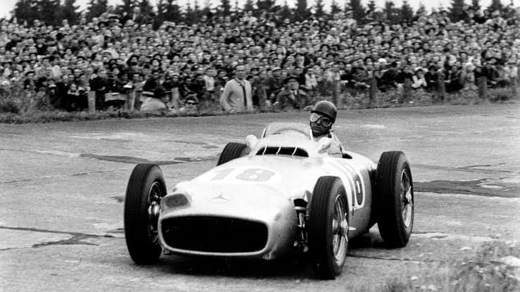
At first glance, the early years of Formula 1 appear much more isolated. Drivers like Giuseppe Farina and Alberto Ascari sit in their own small cluster, reflecting a period where fewer championship battles and team partnerships connected drivers across multiple eras.
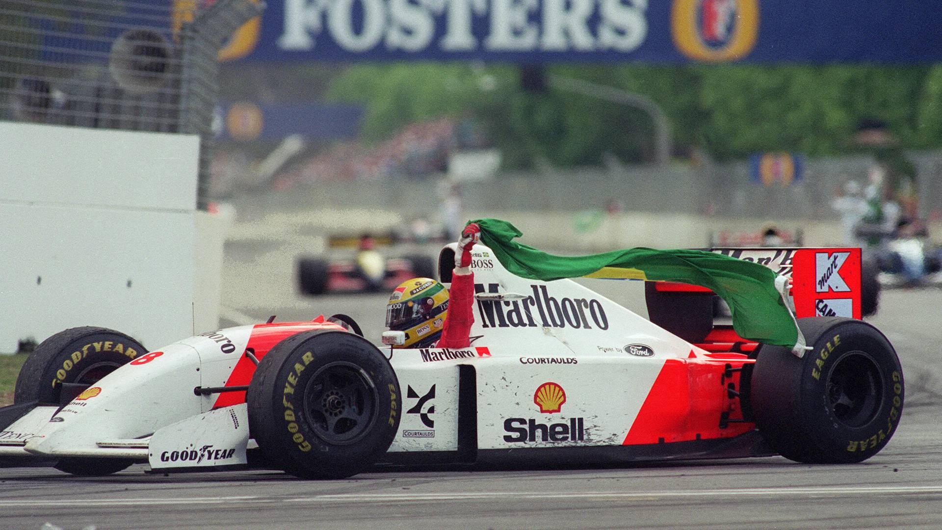
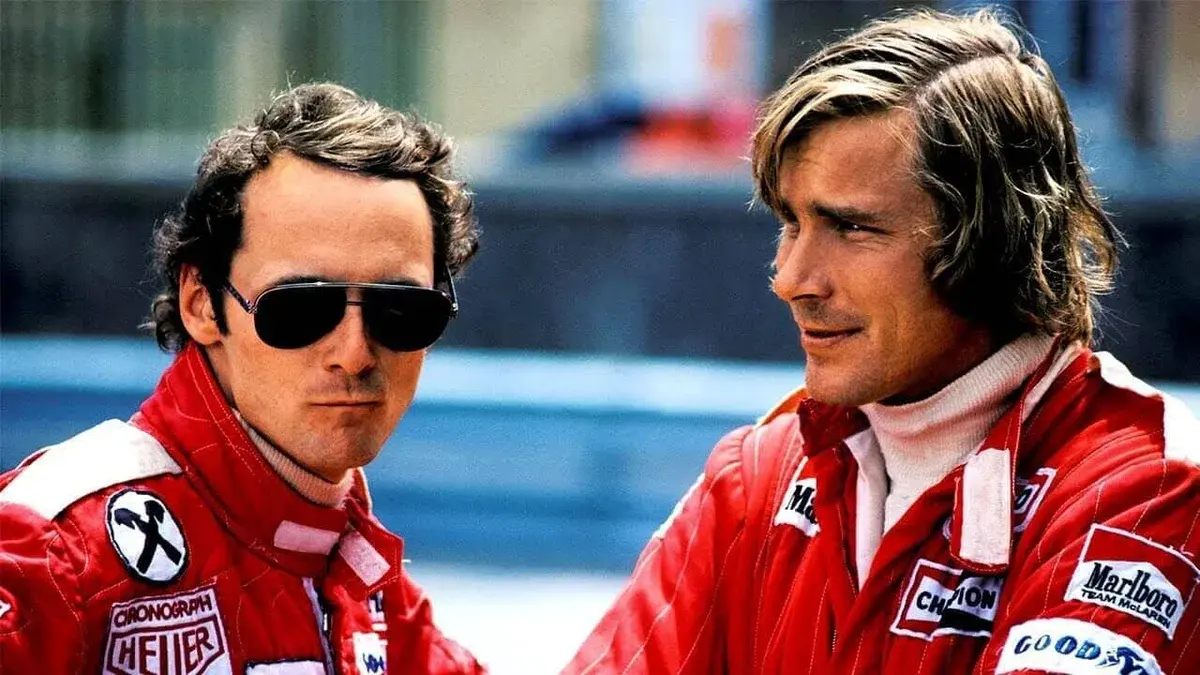
As the sport evolves, these connections become much denser. Drivers such as Niki Lauda, Alain Prost, and Michael Schumacher act as links between different generations of Formula 1 - connected not only through their own championships, but through the teammates and rivals they shared throughout their careers.
This is where graphs become interesting: a championship table tells us who won, but a network begins to reveal how the history of the sport is connected.